-
[PlayData - Day 11] Matplotlib - 데이터 시각화[플레이데이터] 2023. 1. 6. 11:38
1. K-Digital Training 과정
- 빅데이터 기반 지능형SW 및 MLOps 개발자 양성과정 19기 (2023/01/04 - Day 11)
2. 목차
- matplotlib로 그래프 그리기
- 선 그래프
- 그래프 꾸미기
- 산점도
- 막대 그래프
- 히스토그램
- 파이 그래프
- 그래프 저장하기
- pandas로 그래프 그리기
- pandas의 그래프 구조
- pandas의 선 그래프
- pandas의 산점도
- pandas의 막대 그래프
- pandas의 히스토그램
- pandas의 파이 그래프
3. 수업 내용
1. matplotlib로 그래프 그리기
- matplotlib 사용하기
matplotlib의 서브모듈(submodule) 불러오기
import matplotlib.pyplot as plt
# matplotlib만 import 해서는 작동하지 않는다. 서브모듈이 독립적으로 운용되기 때문이다.
선 그래프
기본적인 선 그래프 그리기
plt.plot([x, ]y[, fmt])data1 = [10,14,19,20,25,10,14,19,20,25] plt.plot(data1) # x축은 없어도 자동 생성된다. 0부터 1씩 증가.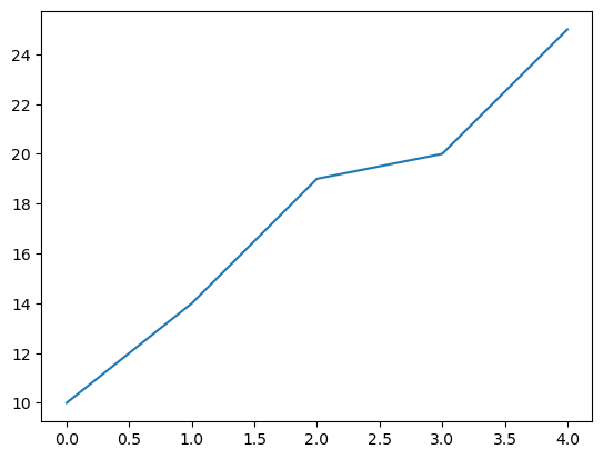
- 객체의 정보없이 출력하기
plt.plot(data1)
plt.show() # 객체의 정보; [<matplotlib.lines.Line2D at 0x17433802100>]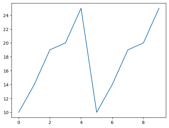
- 별도의 팝업창에 생성하기
%matplotlib qt # 새창에서 그래프가 보인다. plt.plot(data1) %matplotlib inline # 코드 바로 아래에 그래프가 보인다. plt.plot(data1)- x축과 y축이 둘 다 있는 그래프 생성
import numpy as np x = np.arange(-4.5, 5, 0.5) # 배열 x 생성. 범위: [-4.5, 5), 0.5씩 증가. y = 2*x**2 # 수식을 이용해 배열 x에 대응하는 배열 y 생성 [x, y] >>> [array([-4.5, -4. , -3.5, -3. , -2.5, -2. , -1.5, -1. , -0.5, 0. , 0.5, 1. , 1.5, 2. , 2.5, 3. , 3.5, 4. , 4.5]), array([40.5, 32. , 24.5, 18. , 12.5, 8. , 4.5, 2. , 0.5, 0. , 0.5, 2. , 4.5, 8. , 12.5, 18. , 24.5, 32. , 40.5])]- 그래프 생성하기
plt.plot(x,y)
plt.show()
- 여러 그래프 그리기
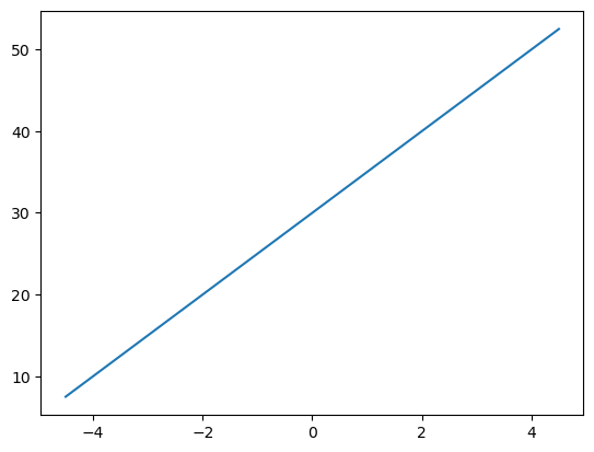
x = np.arange(-4.5, 5, 0.5)
y1 = 2*x**2
y2 = 5*x + 30
y3 = 4*x**2 + 10

import matplotlib.pyplot as plt

plt.plot(x, y1)
plt.plot(x, y2)
plt.plot(x, y3)
plt.show()

# 아래와 같은 형태로도 가능하다
plt.plot(x, y1, x, y2, x, y3)
plt.show()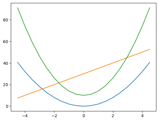
- 새로운 그래프 창을 추가해 그리기
- plt.figure()를 사용
plt.plot(x, y1) # 처음 그리기 함수를 수행하면 그래프를 그림
plt.figure() # 새로운 그래프 창을 생성함
plt.plot(x, y2) # 새롭게 생성된 그래프 창에 그래프를 그림
plt.show()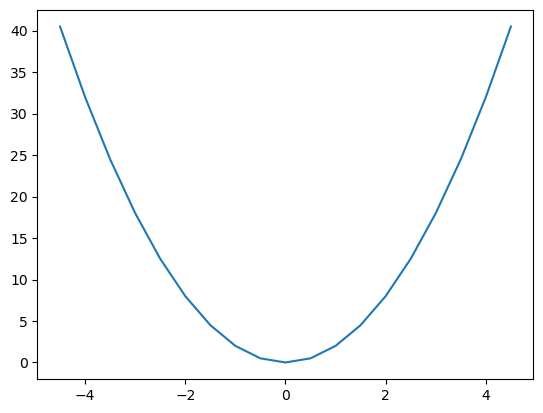
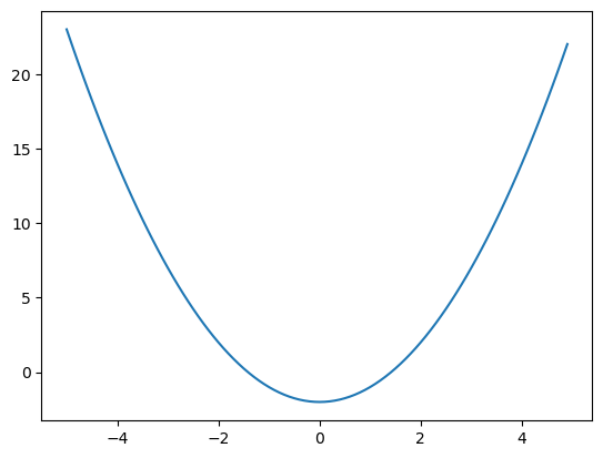
# 데이터 생성
x = np.arange(-5, 5, 0.1)
y1 = x**2 -2
y2 = 20*np.cos(x)**2 # NumPy에서 cos()는 np.cos()으로 입력

# 그래프 그리기
plt.figure(1) # 1번 그래프 창을 생성함
plt.plot(x, y1) # 지정된 그래프 창에 그래프를 그림

plt.figure(2) # 2번 그래프 창을 생성함
plt.plot(x, y2) # 지정된 그래프 창에 그래프를 그림

plt.figure(1) # 이미 생성된 1번 그래프 창을 지정함
plt.plot(x, y2) # 지정된 그래프 창에 그래프를 그림

plt.figure(2) # 이미 생성된 2번 그래프 창을 지정함
plt.clf() # 2번 그래프 창에 그려진 모든 그래프를 지움
plt.plot(x, y1) # 지정된 그래프 창에 그래프를 그림

plt.show() # 1번 그래프창에는 닫지 않고 그리기. 2번 그래프창에는 닫고 새로 그리기.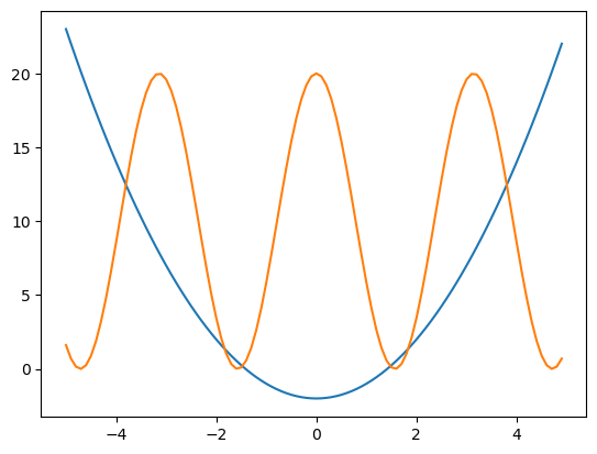
- 서브 플롯에 그리기 (그래프를 나눠서 그리기)
# 데이터 생성
x = np.arange(0, 10, 0.1)
y1 = 0.3*(x-5)**2 + 1
y2 = -1.5*x + 3
y3 = np.sin(x)**2 # NumPy에서 sin()은 np.sin()으로 입력
y4 = 10*np.exp(-x) + 1 # NumPy에서 exp()는 np.exp()로 입력

# 2 × 2 행렬로 이뤄진 하위 그래프에서 p에 따라 위치를 지정 plt.subplot(행,열,위치)
plt.subplot(2,2,1) # p는 1
plt.plot(x,y1)

plt.subplot(2,2,2) # p는 2
plt.plot(x,y2)

plt.subplot(2,2,3) # p는 3
plt.plot(x,y3)

plt.subplot(2,2,4) # p는 4
plt.plot(x,y4)

plt.show()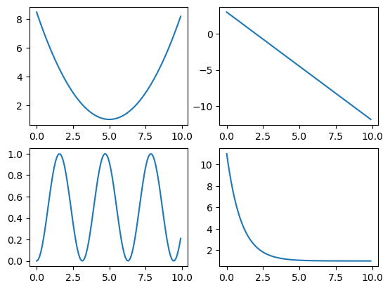
- 그래프의 출력 범위 지정하기
- plt.xlim(xmin, xmax) # x축의 좌표 범위 지정(xmin ~ xmax)
plt.ylim(ymin, ymax) # y축의 좌표 범위 지정(ymin ~ ymax)
x = np.linspace(-4, 4, 100) # [-4, 4] 범위에서 100개의 값 생성
y1 = x**3
y2 = 10*x**2 - 2

plt.plot(x, y1, x, y2)
plt.show()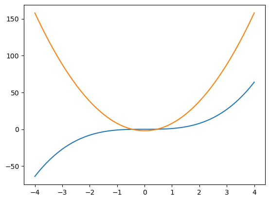
- 겹치는 부분 확대해 보기
plt.plot(x, y1, x, y2)
plt.xlim(-1, 1)
plt.ylim(-3, 3)
plt.show()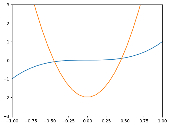
- 그래프 꾸미기
- 출력 형식 지정
fmt = '[color],[line_style],[marker]' # 각 컬러, 선 스타일
x = np.arange(0, 5, 1)
y1 = x
y2 = x + 1
y3 = x + 2
y4 = x + 3
plt.plot(x, y1, x, y2, x, y3, x, y4) plt.show() # 디폴트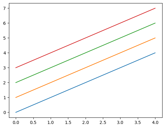
- 색을 지정하기
plt.plot(x, y1, 'm', x, y2, 'y', x, y3, 'k', x, y4, 'c')
plt.show() # 각 색의 초성으로 지정한다. m 마젠타, y 옐로우, k 블랙(blac'k'), c 시안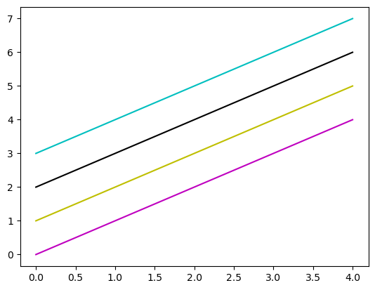
- 선 스타일 지정하기
plt.plot(x, y1, '-', x, y2, '--', x, y3, ':',  x, y4, '-.')
plt.show()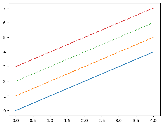
- 마커로 표시하기
plt.plot(x, y1, 'o', x, y2, '^',x, y3, 's', x, y4, 'd')
plt.show() # o 동그라미, ^ 세모, s 스퀘어 d 다이아몬드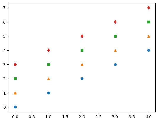
- 혼합해서 지정하기
plt.plot(x, y1, '>--r', x, y2, 's-g', x, y3, 'd:b', x, y4, '-.Xc')
plt.show()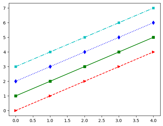
- 라벨, 제목, 격자, 범례, 문자열 표시
x = np.arange(-4.5, 5, 0.5)
y = 2*x**3

plt.plot(x,y)
plt.xlabel('X-axis') # x축 라벨
plt.ylabel('Y-axis') # y축 라벨
plt.show()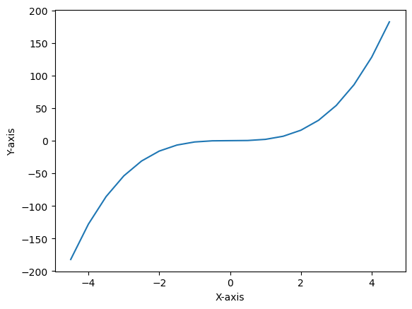
- 그래프에 제목 추가
plt.plot(x,y)
plt.xlabel('X-axis')
plt.ylabel('Y-axis')
plt.title('Graph title')
plt.show()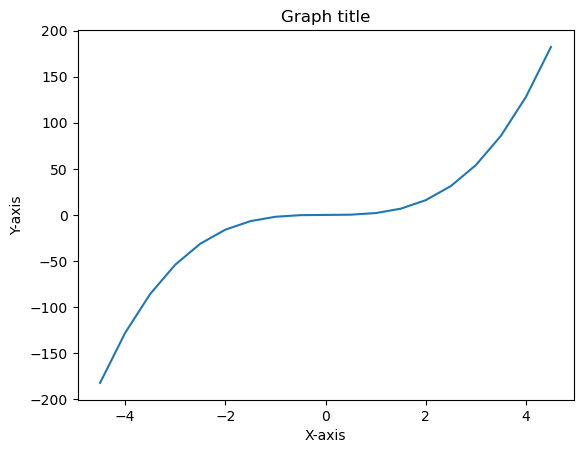
- 그래프에 격자 추가
plt.plot(x,y)
plt.xlabel('X-axis')
plt.ylabel('Y-axis')
plt.title('Graph title')
plt.grid(True) # 'plt.grid()'도 가능 # False를 넣을 경우 나오지 않는다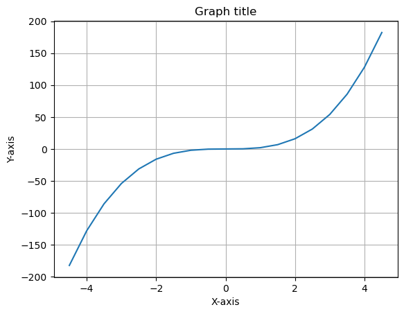
- 범례를 표시하기
x = np.arange(0, 5, 1)
y1 = x
y2 = x + 1
y3 = x + 2
y4 = x + 3

plt.plot(x, y1, '>--r', x, y2, 's-g', x, y3, 'd:b', x, y4, '-.Xc')
plt.legend(['data1', 'data2', 'data3', 'data4'])
plt.show()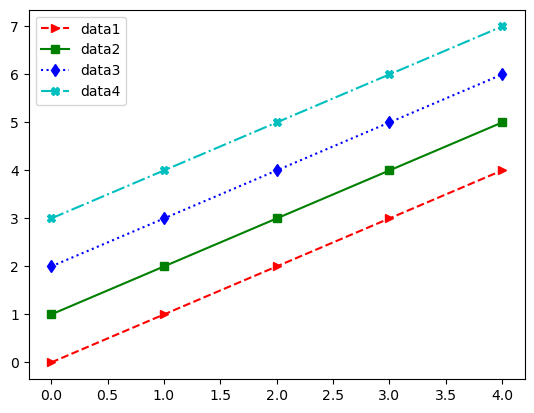
- 범례 위치 옮기기
loc = ""
x위치 = left center right
y위치 = upper center lower
plt.plot(x, y1, '>--r', x, y2, 's-g', x, y3, 'd:b', x, y4, '-.Xc')
plt.legend(['data1', 'data2', 'data3', 'data4'], loc = 'lower right')
plt.show()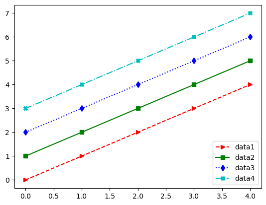
- 위치 값으로 지정하기 (0 ~ 10) + 라벨 + 제목
plt.figure(0, figsize=(7, 6), constrained_layout=False)
plt.plot(x, y1, '>--r', x, y2, 's-g', x, y3, 'd:b', x, y4, '-.Xc')
plt.figlegend(['data1', 'data2', 'data3', 'data4'], loc = (0.88, 0.5))
plt.xlabel('X-axis')
plt.ylabel('Y-axis')
plt.title('Graph title')
plt.grid(False)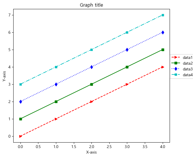
- 추가: 범례 형태 변경
plt.figure(0, figsize=(7, 6), constrained_layout=False)
plt.plot(x, y1, '>--r', x, y2, 's-g', x, y3, 'd:b', x, y4, '-.Xc')
plt.figlegend(['data1', 'data2', 'data3', 'data4'], bbox_to_anchor = (0.8,0.02),
              borderpad=0.8, labelspacing=1, fancybox=True, ncol=4)
plt.xlabel('X-axis')
plt.ylabel('Y-axis')
plt.title('Graph title')
plt.grid(False)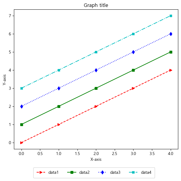
# copy와 deepcopy의 차이 import copy list1 = [3, 2, 5, 1] list2 = copy.copy(list1) list3 = copy.deepcopy(list1) print(list2, list3, id(list1), id(list2), id(list3), id(list1[0]), id(list2[0]), id(list3[0])) # 각 리스트의 id는 달라짐 >>> [3, 2, 5, 1] [3, 2, 5, 1] 1598647510784 1598606927872 1598704779520 1598455310704 1598455310704 1598455310704- 한글로 표시하기
현재 폰트 알아보기
import matplotlib matplotlib.rcParams['font.family'] >>> ['sans-serif']- 폰트 변경하기
matplotlib.rcParams['font.family'] = 'Malgun Gothic' matplotlib.rcParams['axes.unicode_minus'] = False- 그래프에서 폰트가 변경된 것을 확인
plt.plot(x, y1, '>--r', x, y2, 's-g', x, y3, 'd:b', x, y4, '-.Xc')
plt.legend(['데이터1', '데이터2', '데이터3', '데이터4'], loc = 'best')
plt.xlabel('X 축')
plt.ylabel('Y 축')
plt.title('그래프 제목')
plt.grid(True)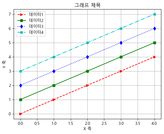
plt.plot(x, y1, '>--r', x, y2, 's-g', x, y3, 'd:b', x, y4, '-.Xc')
plt.text(0, 6, "문자열 출력 1") # (x, y, 'str')
plt.text(0, 5, "문자열 출력 2")
plt.text(3, 1, "문자열 출력 3")
plt.text(3, 0, "문자열 출력 4")
plt.show()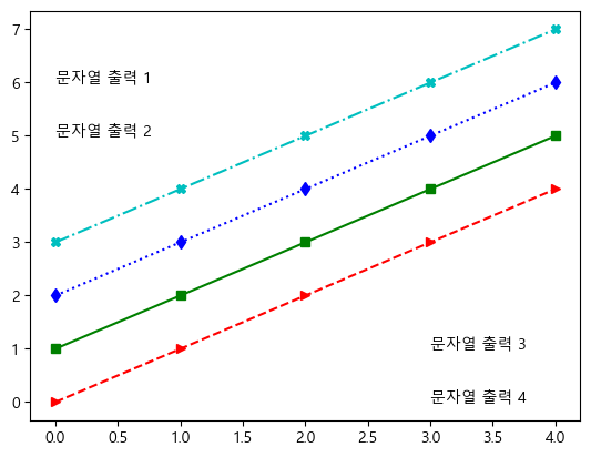
산점도
height = [165, 177, 160, 180, 185, 155, 172]   # 키 데이터
weight = [62, 67, 55, 74, 90, 43, 64]   # 몸무게 데이터

plt.scatter(height, weight)
plt.xlabel('Height(m)')
plt.ylabel('Weight(Kg)')
plt.title('Height & Weight')
plt.grid(True)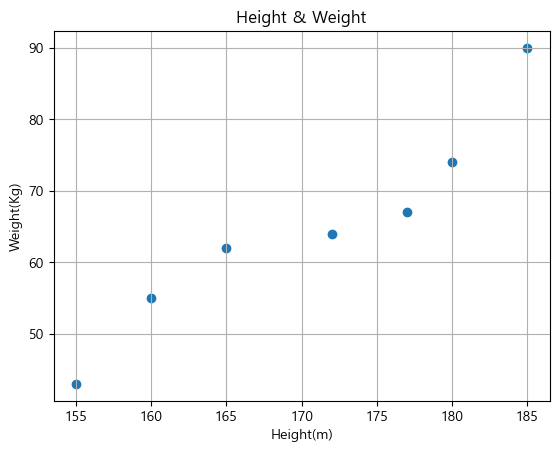
- 마크 크기와 색 지정하기
plt.scatter(height, weight, s=500, c='r') # 마커 크기는 500, 컬러는 붉은색(red)
plt.show()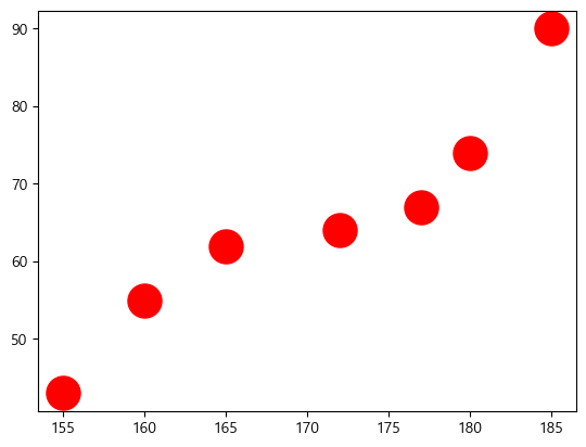
- 데이터마다 다른 크기와 컬러 지정하기
size = 100 * np.arange(1,8) # 데이터별로 마커의 크기 지정
colors = ['r', 'g', 'b', 'c', 'm', 'k', 'y'] # 데이터별로 마커의 컬러 지정

plt.scatter(height, weight, s=size, c=colors)
plt.show()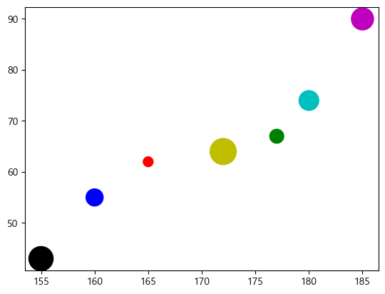
- 지역별 인구밀도 시각화
# 지역별 인구밀도 시각화

city = ['서울', '인천', '대전', '대구', '울산', '부산', '광주']

# 위도(latitude)와 경도(longitude)
lat  = [37.56, 37.45, 36.35, 35.87, 35.53, 35.18, 35.16]
lon = [126.97, 126.70, 127.38, 128.60, 129.31, 129.07, 126.85]

# 인구 밀도(명/km^2): 2017년 통계청 자료
pop_den = [16154, 2751, 2839, 2790, 1099, 4454, 2995] # ---> 마커 크기로 활용

size = np.array(pop_den) * 0.2 # 마커의 크기 지정
colors = ['r', 'g', 'b', 'c', 'm', 'k', 'y'] # 마커의 컬러 지정

plt.scatter(lon, lat, s=size, c=colors, alpha=0.5) # (x, y, size, alpha = 투명도)
plt.xlabel('경도(longitude)')
plt.ylabel('위도(latitude)')
plt.title('지역별 인구 밀도(2017)')


for x, y, name in zip(lon, lat, city):
    plt.text(x, y, name) # 위도 경도에 맞게 도시 이름 출력

plt.show()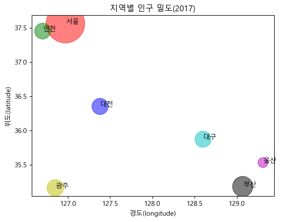
막대 그래프
- plt.bar(x, height [,width = width_f, color = colors, tick_label-tick_labels, align = 'center'(기본) 혹은 'edge', label=labels])
member_IDs = ['m_01', 'm_02', 'm_03', 'm_04'] # 회원 ID
before_ex = [27, 35, 40, 33] # 운동 시작 전
after_ex = [30, 38, 42, 37] # 운동 시작 후
import matplotlib.pyplot as plt import numpy as np n_data = len(member_IDs) # 전체 데이터 수 index = np.arange(n_data) # NumPy를 이용해 배열 생성(0,1,2,3) plt.bar(index, before_ex) # bar(x, y)에서 x=index, height=before_ex로 지정 plt.show()
- x축 라벨 변경하기
plt.bar(index, before_ex, tick_label = member_IDs)
plt.show()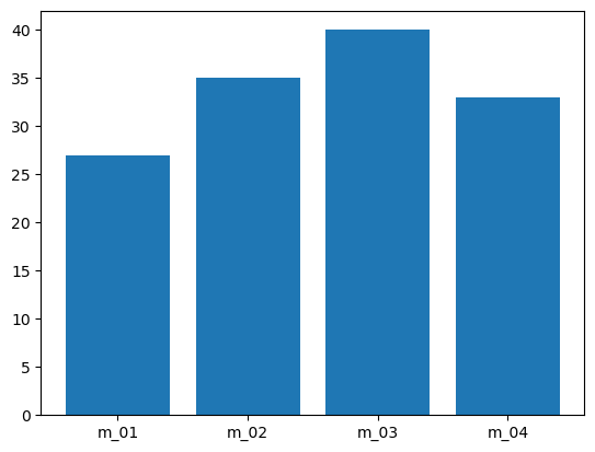
- 칼라 지정하기
colors = ['r', 'g', 'b', 'm']
plt.bar(index, before_ex, color = colors, tick_label = member_IDs)
plt.show()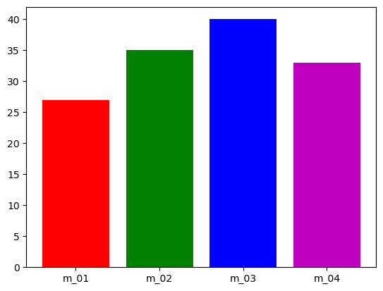
- 막대 그래프의 폭을 조절
plt.bar(index, before_ex, tick_label = member_IDs, width = 0.4) # 0~1 사이의 수
- 가로 그래프로 만들기
plt.barh()
width는 사용 불가
colors = ['r','g','b','m']
plt.barh(index, before_ex, color = colors, tick_label = member_IDs)
plt.show()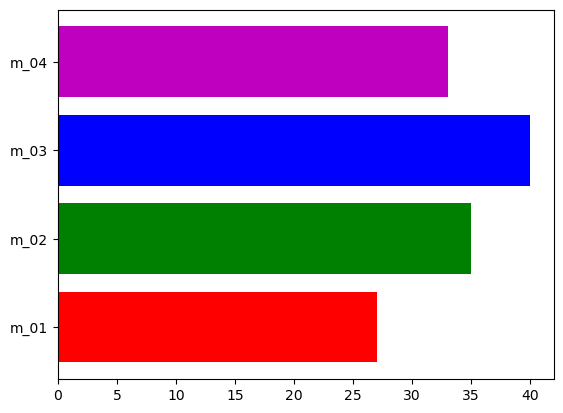
- 두 개의 데이터를 동시에 출력하여 비교하기
barWidth = 0.4
plt.bar(index, before_ex, color = 'c', align = 'edge', width = barWidth, label = 'before')
plt.bar(index+barWidth, after_ex, color = 'm', align = 'edge', width = barWidth, label='after')

plt.xticks(index + barWidth,member_IDs)
plt.legend()
plt.xlabel('화원 ID')
plt.ylabel('윗몸일으키기 횟수')
plt.title('운동 시작 전과 후의 근지구력(복근) 비교')
plt.show()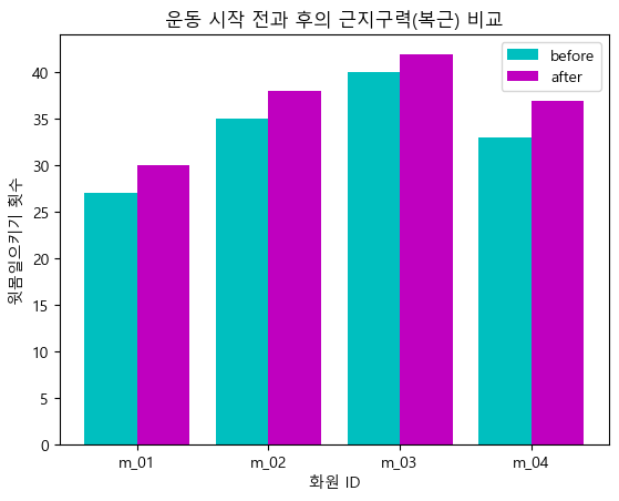
히스토그램
도수 분포표
- 변량(variate): 자료를 측정해 숫자로 표시한 것(예: 점수,키, 몸무게, 판매량, 시간 등)
- 계급(class): 변량을 정해진 간격으로 나눈 구간(예: 시험 점수를 60 ~ 70, 70 ~ 80, 80 ~ 90, 90 ~ 100
- 계급의 간격(class width): 계급을 나눈 크기(예: 앞의 시험 점수를 나눈 간격은 10
- 도수(frequendcy): 나눠진 계급에 속하는 변량의 수(예: 각 계급에서 발생한 수로 3, 5, 7, 4)
- 도수 분포표(requency distribution table): 계급에 도수를 표시한 표
60부터 5의 간격으로 8개의 계급으로 나누기
math = [76, 82, 84, 83, 90, 86, 85, 92, 72, 71, 100, 87, 81, 76, 94, 78, 81, 60, 79, 69, 74, 87, 82, 68, 79]
plt.hist(math)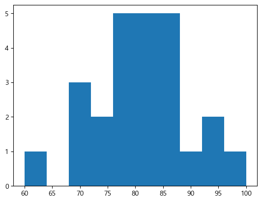
plt.hist(math, bins = 8)
plt.show()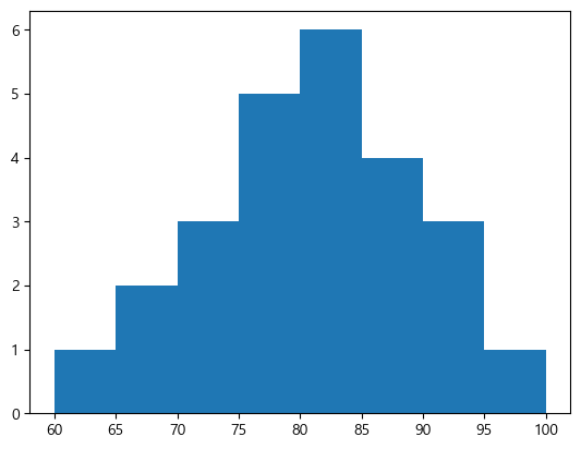
plt.hist(math, bins= 8)
plt.xlabel('시험 점수')
plt.ylabel('도수(frequency)')
plt.title('수학 시험의 히스토그램')
plt.grid()
plt.show()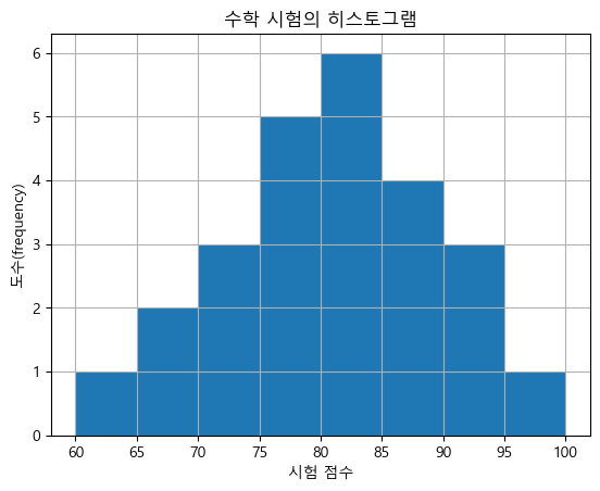
파이 그래프
원 안에 데이터의 각 항목이 차지하는 비중만큼 부채꼴 모양으로 이뤄진 그래프
fruit = ['사과', '바나나', '딸기', '오렌지', '포도']
result = [7,6,3,2,2]

plt.pie(result)
plt.show()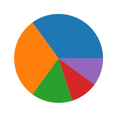
- 크기 조정
plt.figure(figsize = (3,3))
plt.pie(result)
plt.show()
- 데이터 라벨과 비율 추가하기
plt.figure(figsize = (5,5))
plt.pie(result, labels = fruit, autopct='%.1f%%')
plt.show()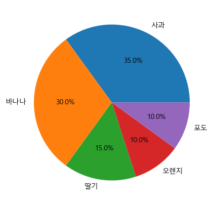
- 회전 시작 위치와 방향 변경하기
plt.figure(figsize=(5,5))
plt.pie(result, labels=fruit, autopct='%.1f%%', startangle=90, counterclock=False)
plt.show()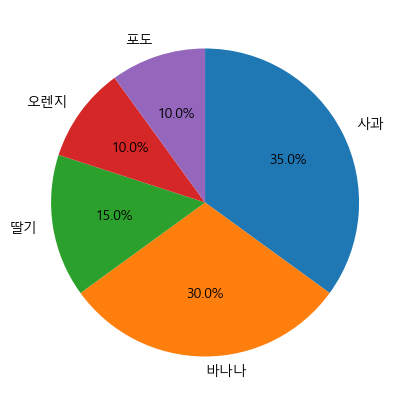
- 그림자 효과 추가 및 특정 부분 강조하기
explode_value = (0.1, 0.1, 0.1, 0.1, 0.1)

plt.figure(figsize=(5,5))
plt.pie(result, labels=fruit, autopct='%.1f%%', startangle=90, counterclock = False,
       explode = explode_value, shadow = True, labeldistance=1.1, pctdistance=0.7)
plt.show()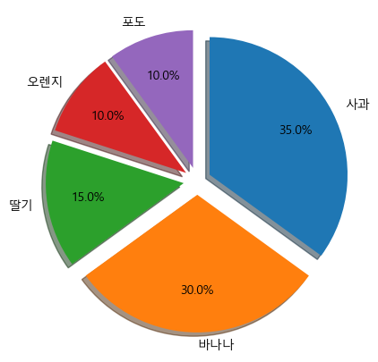
그래프 저장하기
만든 그래프를 이미지 파일로 저장하기
plt.savefig(file_name, [, dpi = dpi_n(기본은 100)])크기 알아보기
import matplotlib as mpl
mpl.rcParams['figure.figsize']

>>> [6.4, 4.8]
mpl.rcParams['figure.dpi'] >>> 100.0x = np.arange(0, 5, 1) y1 = x y2 = x + 1 y3 = x + 2 y4 = x + 3 plt.plot(x, y1, x, y2, x, y3, x, y4) plt.grid(True) plt.xlabel('x') plt.ylabel('y') plt.title('Saving a figure') # 그래프를 이미지 파일로 저장. dpi는 100으로 설정. plt.savefig('C:/myPyCode/figures/saveFigTest1.png', dpi = 100) plt.show()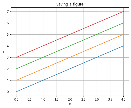
import matplotlib.pyplot as plt

fruit = ['사과', '바나나', '딸기', '오렌지', '포도']
result = [7,6,3,2,2]
explode_value = (0.1,0,0,0,0)

plt.figure(figsize = (5,5))
plt.pie(result, labels=fruit, autopct='%.1f%%',
       startangle=90, counterclock=False, explode=explode_value,
       shadow=True)

plt.savefig('C:\\myPyCode\\figures\\saveFigTest3.png', dpi=200) # 색깔을 다양하게 쓸 경우 dpi를 높이면 좋다.
plt.show()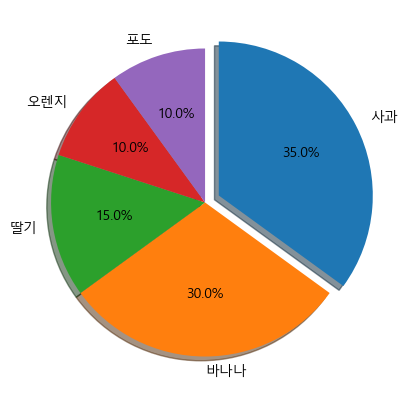
2. Pandas로 그래프 그리기
Pandas의 그래프 구조
Series_data.plot([kind = 'graph_kind'][,option])
DataFrame_Data.plot([x=label 혹은 position, y=label 혹은 position,] [kind='graph_kind'][,option])Pandas의 선 그래프
import pandas as pd
import matplotlib.pyplot as plt

s1 = pd.Series([1,2,3,4,5,6,7,8,9,10])
s1
>>> 0 1 1 2 2 3 3 4 4 5 5 6 6 7 7 8 8 9 9 10 dtype: int64s1.plot() plt.show()
- 인덱스 값을 지정하면 x값도 변경된다.
s2 = pd.Series([1,2,3,4,5,6,7,8,9,10],
              index = pd.date_range('2023-01-01', periods=10))
s2

>>>
2023-01-01     1
2023-01-02     2
2023-01-03     3
2023-01-04     4
2023-01-05     5
2023-01-06     6
2023-01-07     7
2023-01-08     8
2023-01-09     9
2023-01-10    10
Freq: D, dtype: int64
s2.plot() plt.show()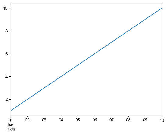
s2.plot(grid = True)
plt.show()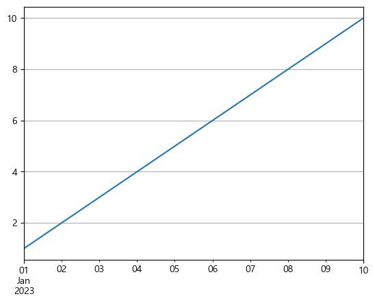
- csv 파일 불러오기
df_rain = pd.read_csv('C:/myPyCode/data/sea_rain1.csv', index_col='연도')
df_rain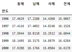
- 데이터를 그래프로
matplotlib.rcParams['font.family'] = 'Malgun Gothic'
matplotlib.rcParams['axes.unicode_minus'] = False

df_rain.plot()
plt.legend(bbox_to_anchor = (0.87,-0.15), borderpad=0.8, labelspacing=1, fancybox=True, ncol=4)
plt.show()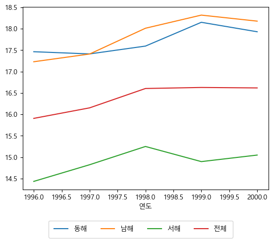
- 라벨 및 제목 붙이기
rain_plot = df_rain.plot(grid = True, style = ['r--*', 'g-o', 'b:*', 'm-.p'])
rain_plot.set_xlabel("연도")
rain_plot.set_ylabel("강수량")
rain_plot.set_title("연간 강수량")
plt.legend(bbox_to_anchor = (0.87,-0.15), borderpad=0.8, labelspacing=1, fancybox=True, ncol=4)
plt.show()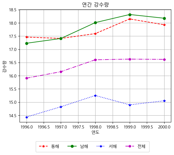
- 연도별 1인당 주거면적 데이터 생성
import numpy as np

year = np.arange(2006, 2018, 2).tolist()
area = [26.2, 27.8, 28.5, 31.7, 33.5, 33.2]
table = {'연도':year, '주거면적':area}

df_area = pd.DataFrame(table, columns=['연도', '주거면적'])
df_area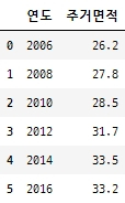
df_area.plot(x='연도', y='주거면적', grid = True, title = '연도별 1인당 주거면적')
plt.savefig(r'C:\myPyCode\figures\saveFigTest3.png', dpi=200)
plt.show()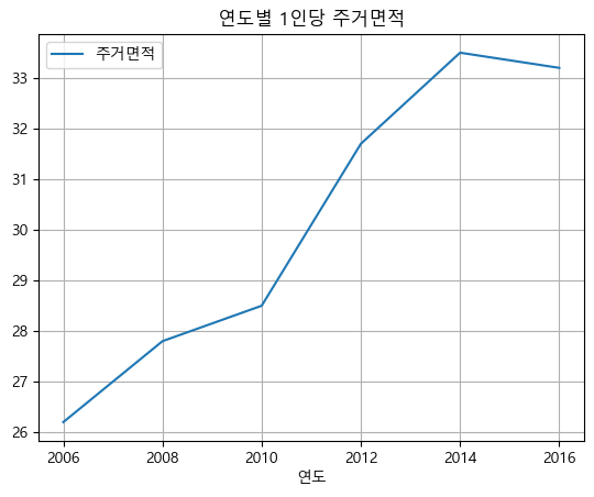
Pandas의 산점도
10일 동안 기록한 일일 최고 기온과 아이스크림 판매량 데이터
temperature = [25.2, 27.4, 22.9, 26.2, 29.5, 33.1, 30.4, 36.1, 34.4, 29.1]
Ice_cream_sales = [236500, 357500, 203500, 365200, 446600, 574200, 453200, 675400, 598400, 463100]

dict_data = {'기온':temperature, '아이스크림 판매량':Ice_cream_sales}
df_ice_cream = pd.DataFrame(dict_data, columns=['기온', '아이스크림 판매량'])

df_ice_cream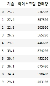
df_ice_cream.plot.scatter(x='기온', y='아이스크림 판매량', grid=True,
                          title='최고 기온과 아이스크림 판매량')
plt.show()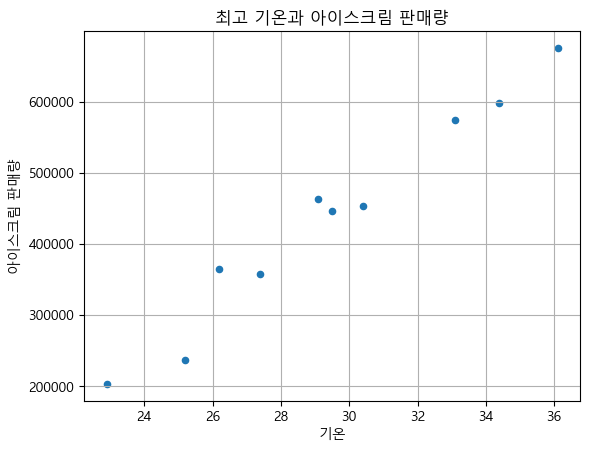
Pandas의 막대 그래프
학점과 학생 수 DataFrame 생성grade_num = [5, 14, 12, 3] students = ['A', 'B', 'C', 'D'] df_grade = pd.DataFrame(grade_num, index=students, columns = ['Student']) df_grade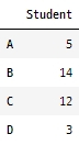
grade_bar = df_grade.plot.bar(grid = True, rot=0)
grade_bar.set_xlabel("학점")
grade_bar.set_ylabel("학생수")
grade_bar.set_title("학점별 학생 수 막대 그래프")
plt.show()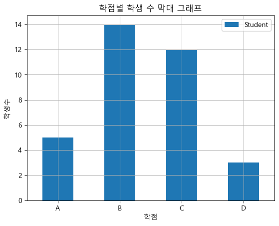
pandas의 히스토그램
math = [76,82,84,83,90,86,85,92,72,71,100,87,81,76,94,78,81,60,79,69,74,87,82,68,79]

df_math = pd.DataFrame(math, columns = ['Student'])

math_hist = df_math.plot.hist(bins=8, grid = True)
math_hist.set_xlabel("시험 점수")
math_hist.set_ylabel("도수(frequency)")
math_hist.set_title("수학 시험의 히스토그램")

plt.show()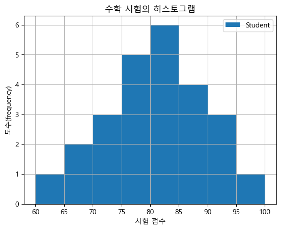
pandas의 파이 그래프
fruit = ['사과', '바나나', '딸기', '오렌지', '포도']
result = [7, 6, 3, 2, 2]

df_fruit = pd.Series(result, index = fruit, name = '선택한 학생수')
df_fruit

>>>
사과     7
바나나    6
딸기     3
오렌지    2
포도     2
Name: 선택한 학생수, dtype: int64
df_fruit.plot.pie(title = '과일 선호도 조사 결과', ylabel='') plt.show()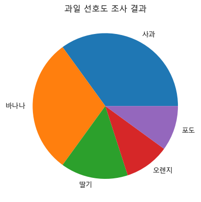
- 그림자 효과 추가 및 특정 부분 강조, 회전 시작 방향 변경, 데이터 라벨과 비율 모두 추가한 그래프
- 그래프 아래 table까지 추가
explode_value = (0.1, 0, 0, 0, 0)
fruit_pie = df_fruit.plot.pie(figsize=(7,5), autopct='%.1f%%', startangle=90,
                             counterclock=False, explode=explode_value, shadow=True, table=True,
                             title = '과일 선호도 조사 결과', ylabel='') # table까지 표시

plt.savefig('C:/myPyCode/figures/saveFigTest3.png', dpi=200)
plt.show()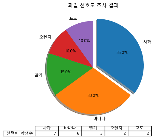
'[플레이데이터]' 카테고리의 다른 글
[PlayData - Day 13] BeautifulSoup - 웹 스크레이핑(Web Scraping) (0) 2023.01.09 [PlayData - Day 12] 파이썬으로 엑셀 파일 다루기 (0) 2023.01.06 [PlayData - Day 10] Pandas - 구조적 데이터 표시와 처리 (0) 2023.01.06 [PlayData - Day 9] Numpy - 배열 데이터 다루기 (1) 2023.01.06 [PlayData - Day 8] 모듈 (0) 2022.12.29